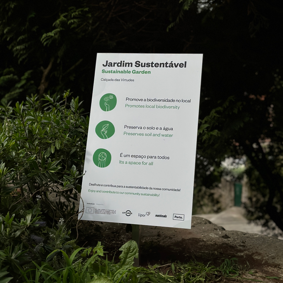
Lipor and Porto. sought to develop informative signs for their gardens, promoting community and the sustainability of these spaces.
In this context, I developed graphics that allowed a quick and clear reading, using contrasting colors but that would fit in the environment in which they were going to be inserted.
The iconographic approach was more illustrative, relatable, somewhat deconstructing the institutional approach that one would expect.